Metro Transit Omaha
Public transit rebranding to get the next generation of riders on board.
- Naming
- Brand identity
- Logo
- EXTERIOR SIGNAGE
- AD / PROMO DESIGN
- Website
- VEHICLE GRAPHICS
Metro Transit provides mass transit across the city of Omaha, and extending into the surrounding greater metro area. In the early 2000s, Metro capitalized on growing interest young professionals had in public transit. They knew their existing branding was all over the board, with almost no two implementations the same.
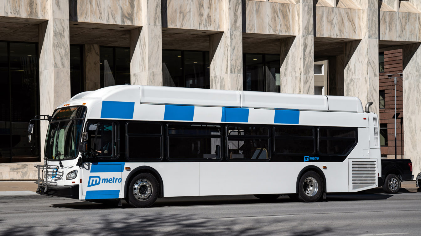
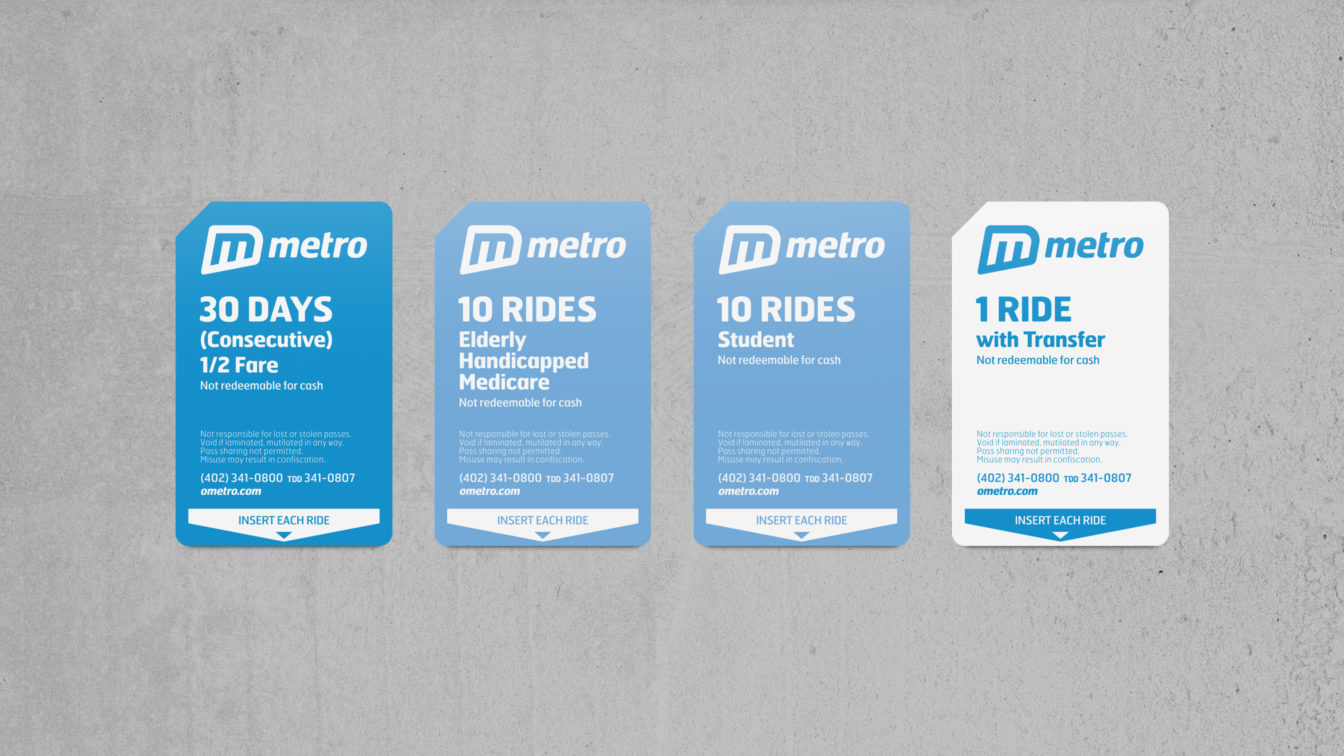
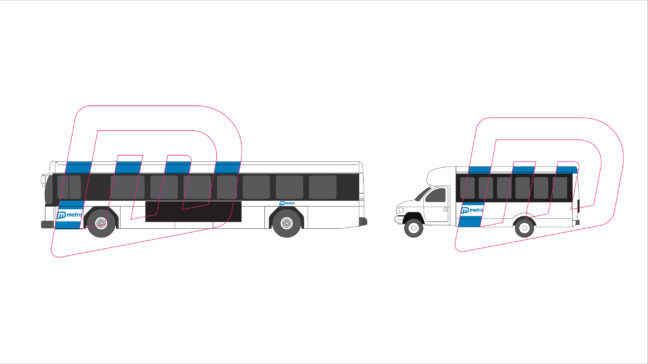
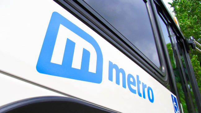
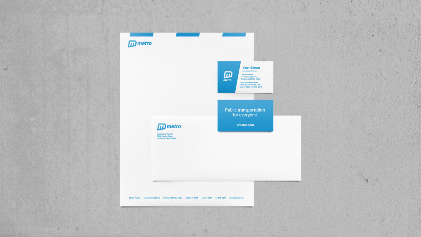
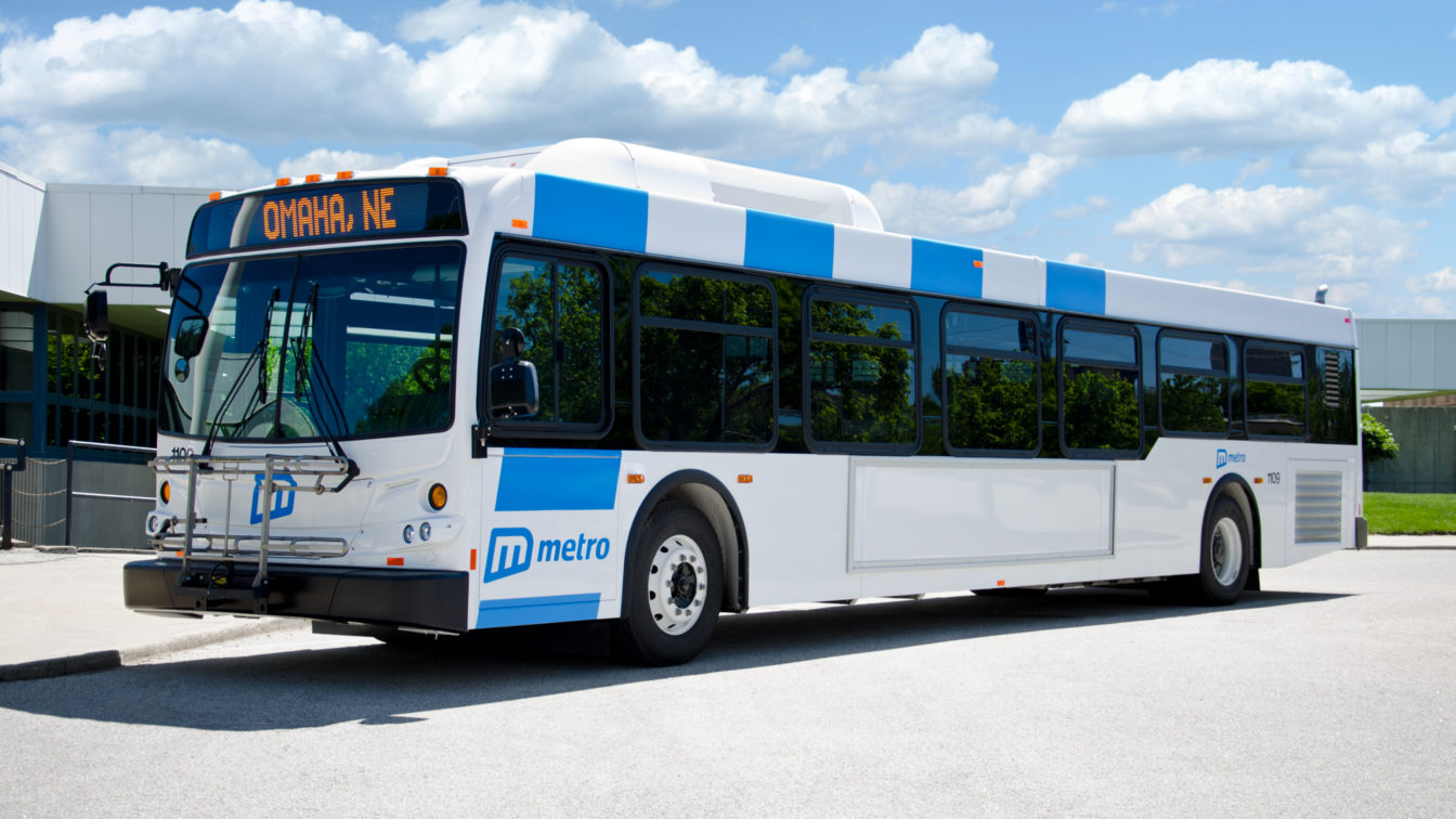
With a comprehensive rebrand of the citywide system, we helped establish Metro as reliable, professional, and modern. We built a bold, iconic logo that can be easily recognized even at a distance, so bus stops are easier to spot. Bringing all their signage, fleet, and stops under the new brand made Metro an easier choice for riders across the city.
Public transportation is one of the most widely recognized factors in retaining talent in a city, and the City of Omaha has worked hard to involve Metro Transit in city planning discussions. Metro is adding a bus rapid transit line in 2018 to continue to forge new modes of transportation in the Omaha area.