Artemis Teas & Botanicals
Rebranding tripled Artemis’ revenue, and landed them on store shelves across the nation.
- Brand Identity
- Logo
- Retail Packaging
- BUSINESS PAPERS
- Website
After initial local success with their teas, Artemis sensed the opportunity to expand into retail, wholesale, bulk, and even online markets. They would need branding and packaging that both maintained their commitment to the environment and elevated the brand to a professionalism that would net them presence on store shelves.
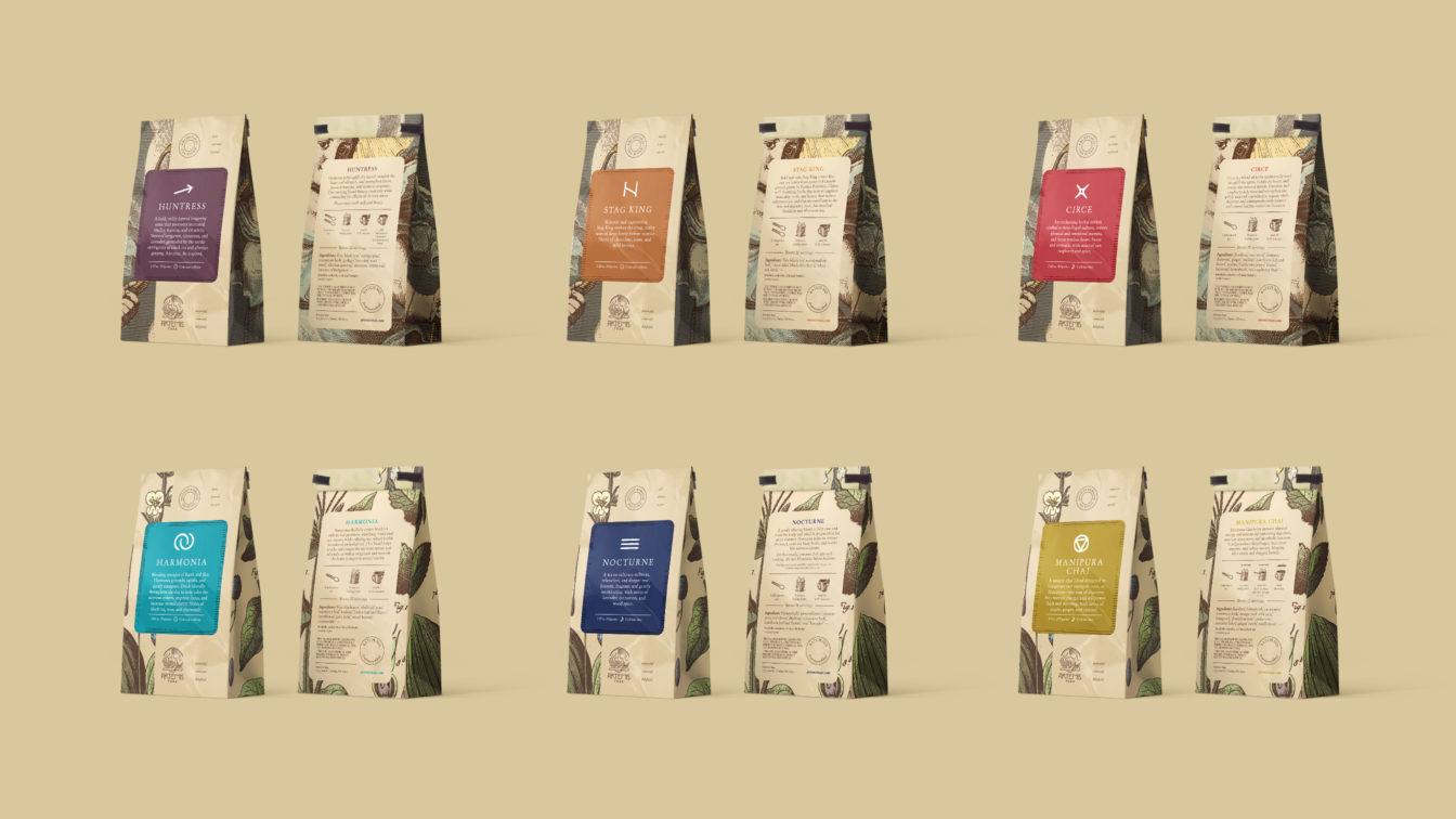
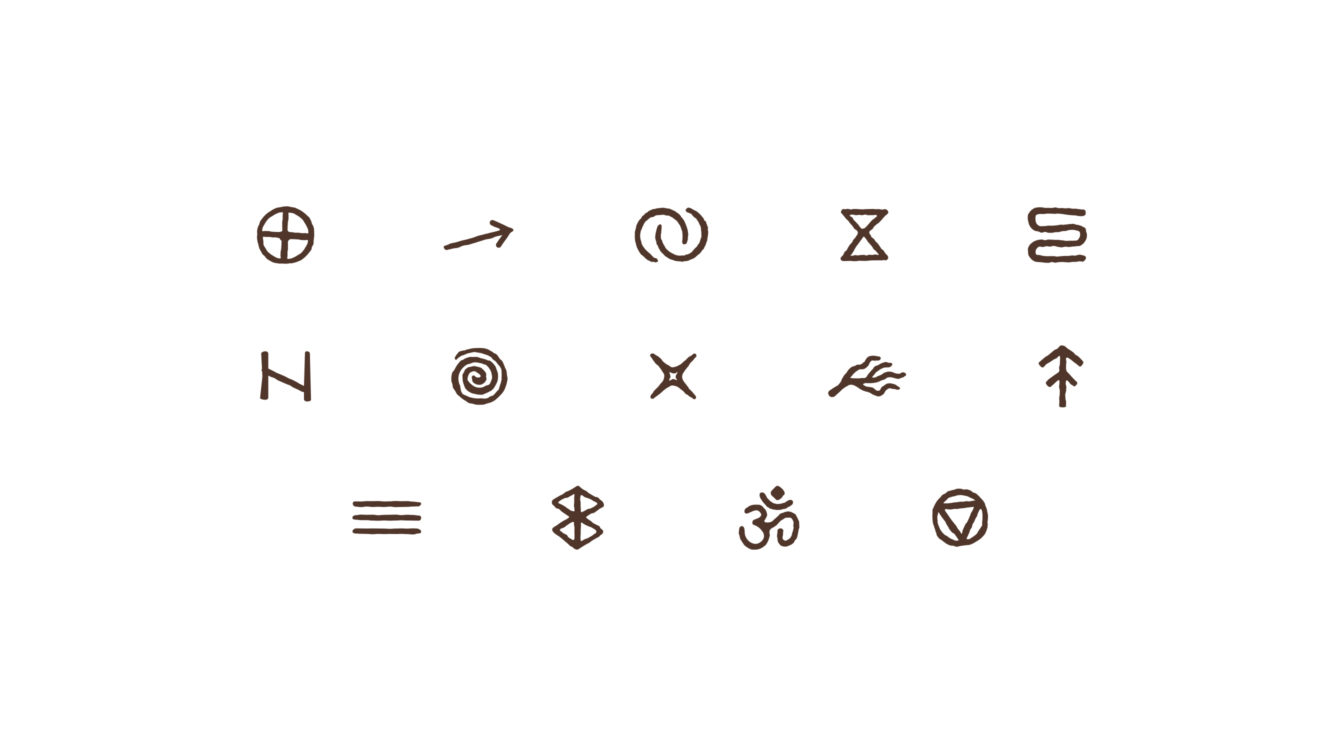
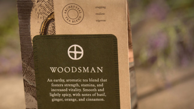
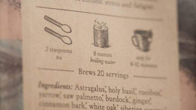
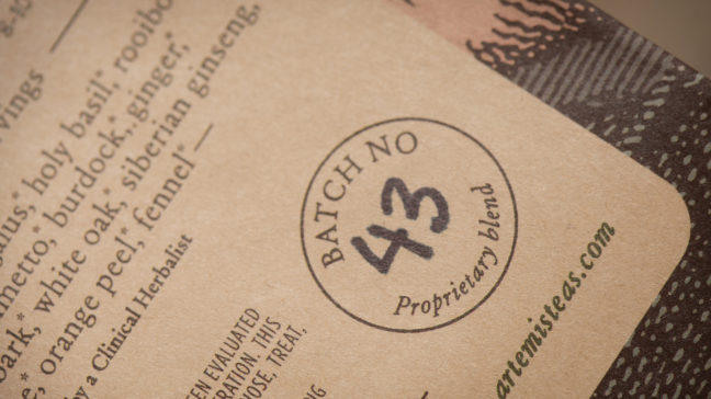
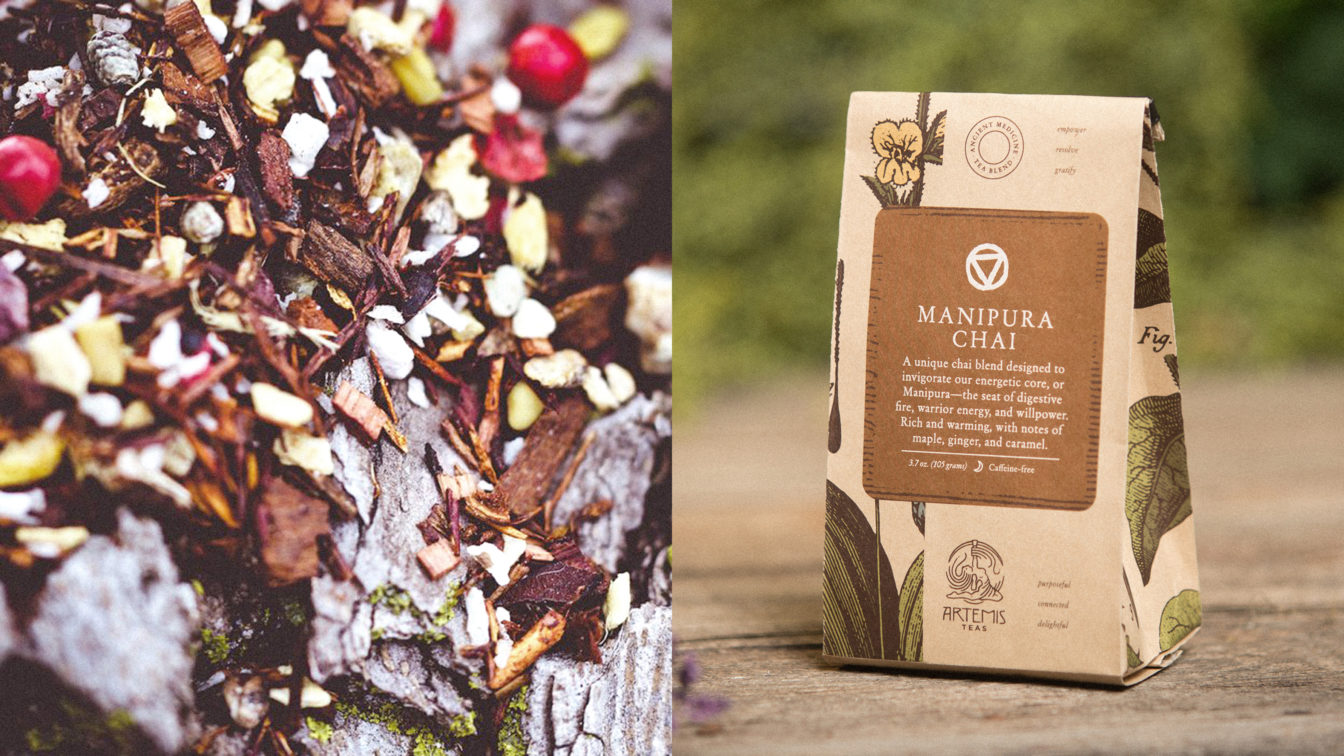
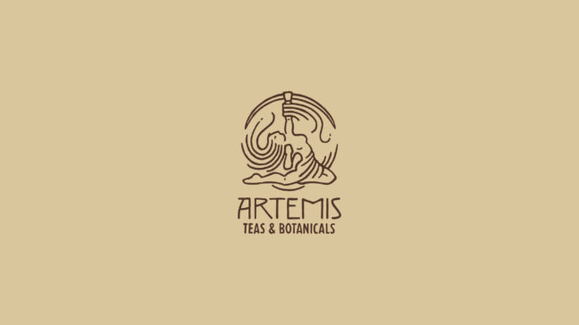
For the logo, we created a hand-crafted illustration of the Greek goddess, bow drawn heavenward in an aspirational pose, in a style that reiterates the artisanal quality of the tea. Each tea is hand-blended and mindfully crafted with unique purpose and flavor. Likewise, the packaging design for each blend includes its own color and an identifying rune. The bags feature one of two styles, distinguishing between the two tea types: ancient medicine (featuring a woodcut of various tea ingredients) or archetypal (featuring a woodcut of Artemis).
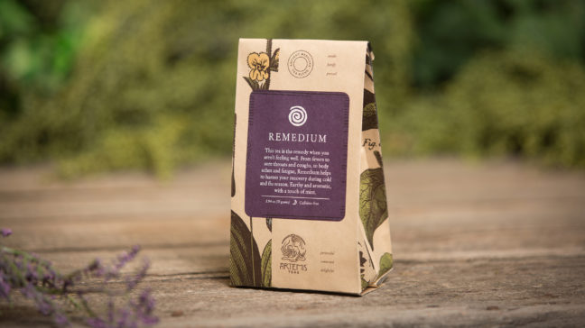
To meet the sustainable/earth-friendly needs, we sourced a compostable kraft laminated bag that features the industry’s highest percentage of compostable material by weight.
With Oxide’s help, Artemis’ clientele grew from a hyper-local Omaha market to a national market — enjoyed in more than a dozen states across the nation, from Hawaii to D.C. Wholesale purchasing increased tenfold, expanding to include coffee and tea shops, retail, restaurants, yoga studios, and offices.
