Mula Mexican Kitchen & Tequileria
Beating the odds, Mula’s unique restaurant brand is still going strong after eight years.
- Brand identity
- Logo
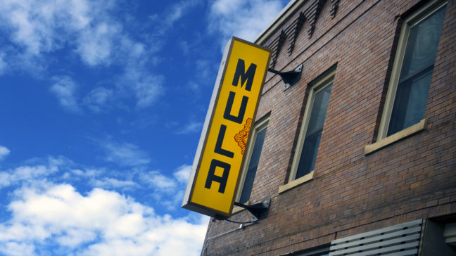
- EXTERIOR SIGNAGE
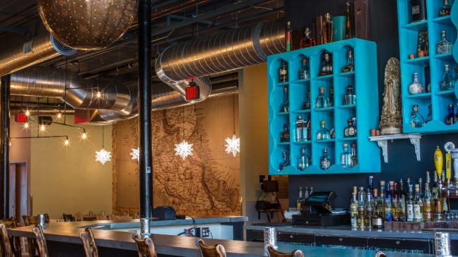
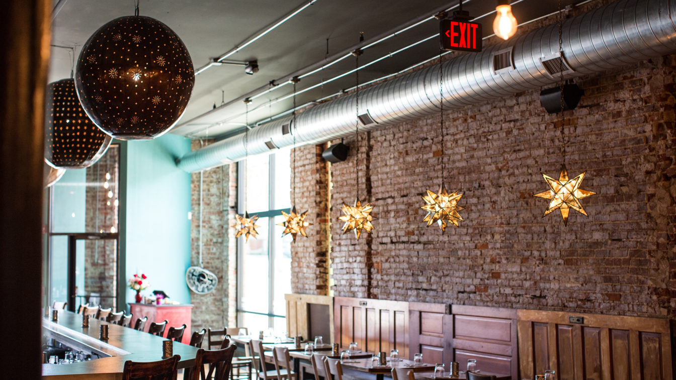
- INTERIOR DESIGN
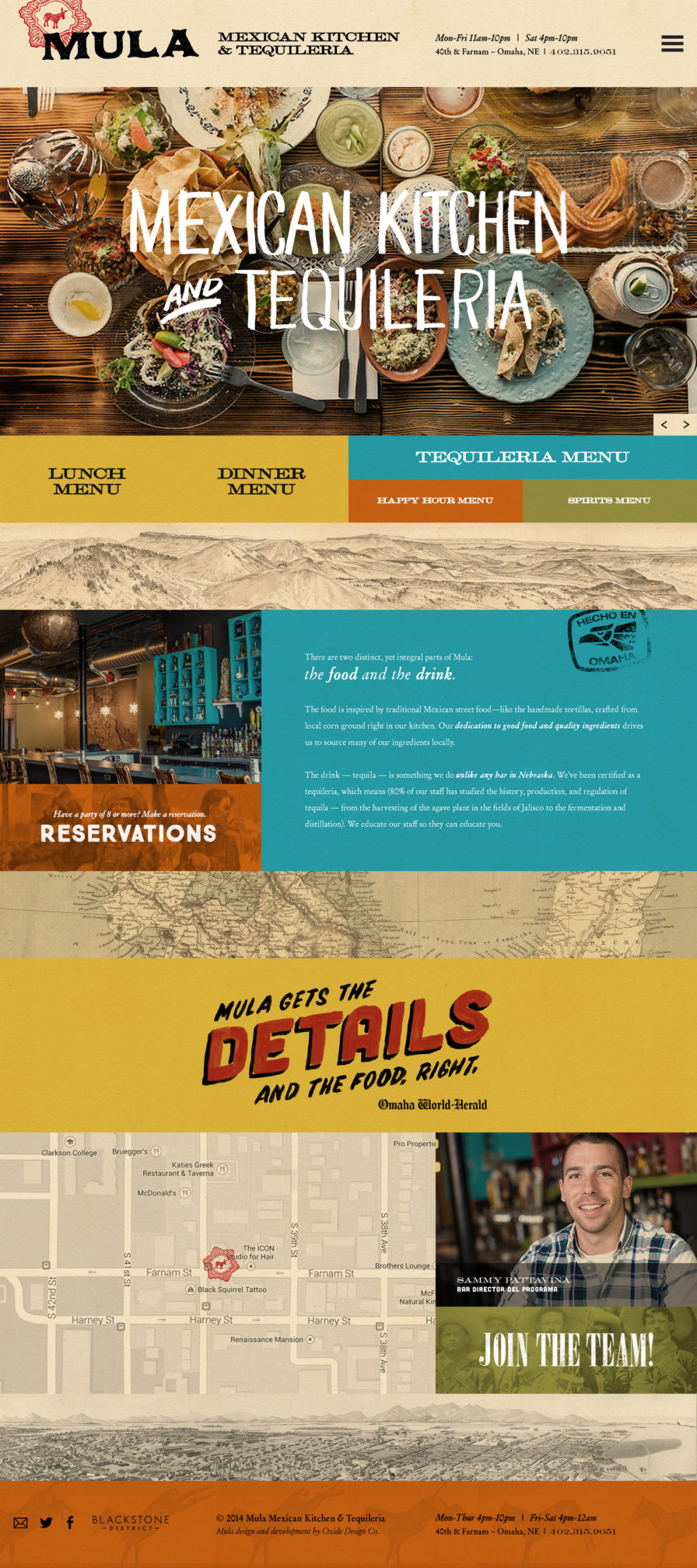
- Website
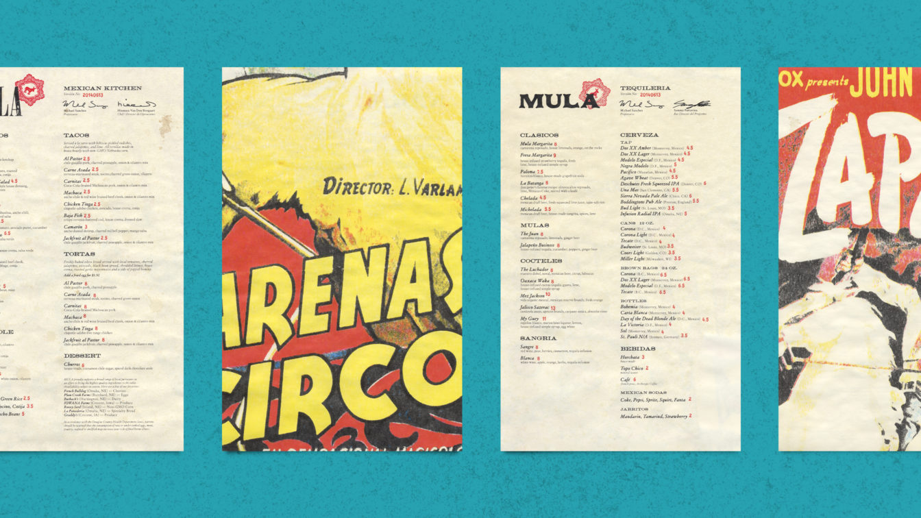
- MENU DESIGN
- Business papers
- Murals
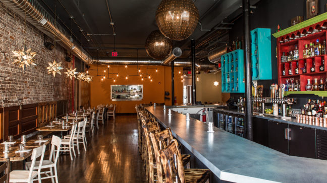
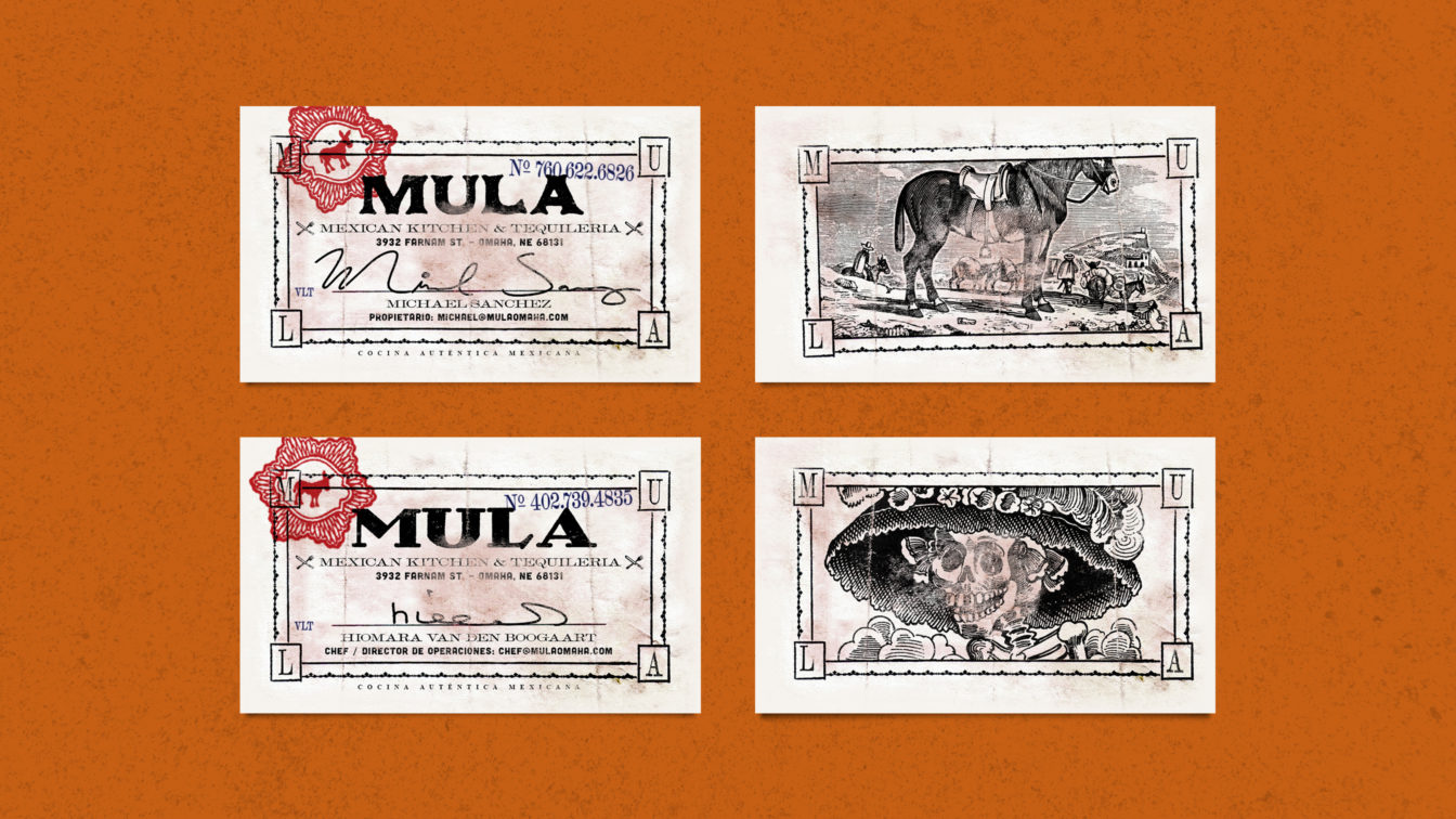
Michael Sanchez recognized the imperative for his restaurant to have standout branding, both as an identifiable logo and an interior aesthetic. Mula’s branding needed to reflect the street-food feel, and it needed to capture the double meaning of the restaurant’s name — “Mula” being the Spanish word for mule and a play on the slang term for money (“moolah”).
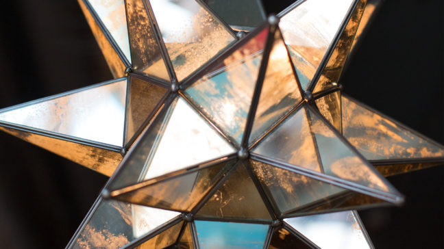
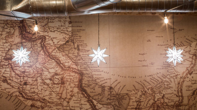
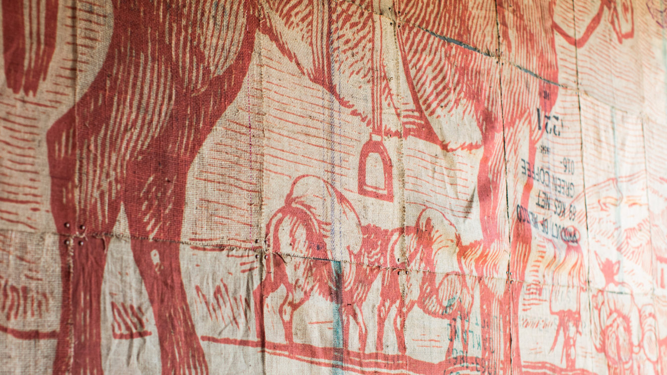
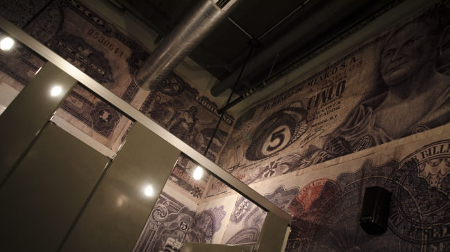
We developed the logo as a bright red mule in the center of an engraved currency pattern overlaying the word “Mula” in all-caps black text. The logo is hand-stamped every time, and the font changes as often as possible. This goes against the consistency we typically preach to our clients, but with the basic rules in place, consistency is still achieved all while creating a brand that has the “less corporate” look and feel of a Mexican street restaurant. We carried the theme through the menus and into the exterior and interior design of the space — signage, color palette selections, two huge murals, framed wall art, and custom wallpaper for the restrooms featuring vintage Mexican currency.
After the first year’s success led to extended hours, Michael Sanchez had this to say: “Working with Oxide was not only fun, but unbelievably beneficial. I can say, with absolute certainty, that my business is more powerful and profitable because of Oxide!”